Yamidoo First Theme to Blogger Template


LIVE DEMO                               DOWNLOAD

Yamidoo First Theme is a Magazine-Style First Theme designed byWpzoom for any type of informative websites such as a complex News Blog, or simply informative blog. With a simple layout  a perfect look for your blog.

This theme has converted to Blogger Template by TUTORIALLOGGER.
Follow this instruction:

1. if you have edit widget tab (Popular and Label), Go to Edit Html 

find this

 .tab_sidebar_list

look like:  .tab_sidebar_list { display: ; }

adding this: "none"

look like:  .tab_sidebar_list { display: none; }


2. Find this too: #nav ul

look like: #nav ul{list-style:none;}

adding : z-index number

look like:  #nav ul{list-style:none;z-index:9999;}

How To Add Social Media Icons To Blogger Header

social media icons, facebook icons, social media icons for bloggerThis tutorial will help you to add social media icons in the top right corner of the page which could increases the likelihood that readers can follow through the various social networks. There are several ways to do this, likeadding a new widget section to the blog header but now, we'll do it using an unordered list that uses icons of Facebook, Twitter, Google+ and blog feed, and as a bonus, the icons will rotate when you hover over them.

You can see a demo in this test blog.


ADDING SOCIAL MEDIA ICONS TO BLOGGER HEADER

Step 1. From your Blogger dashboard, go to Template and click on the Edit HTML button:

blogger blogspot, blogger template, blogger gadgets

Step 2. To expand the style, click on the small arrow on the left of <b:skin>...</b:skin> (screenshot 1), then click anywhere inside the code area to search (using CTRL + F) for the ]]></b:skin> tag (screenshot 2) and add this code just above it:

  /* Social icons for Blogger
----------------------------------------------- */

#social-icons {
margin-bottom:-30px;
height:50px;
width:100%;
display:block;
clear:both;
z-index: 2;
position: relative;
}
.social-media-icons {
display:table
}
.social-media-icons ul {
text-align:right;
padding:5px 5px 0 0
list-style-image:none;
list-style-position:outside;
list-style-type:none;
}
.social-media-icons ul {
margin-bottom:0;
padding:0;
float:right;
}
.social-media-icons li.media_icon {
margin-left:6px;
padding-left:0 !important;
background:none !important;
display:inline;
float:left;
}
.social-media-icons li:hover {
-moz-transform: rotate(360deg);
-webkit-transform: rotate(360deg);
-o-transform: rotate(360deg);
transform: rotate(-360deg);
-moz-transition: all 0.5s ease-in-out;
-webkit-transition: all 0.5s ease-in-out;
-o-transition: all 0.5s ease-in-out;
-ms-transition: all 0.5s ease-in-out;
transition: all 0.5s ease-in-out;
}

Screenshot 1:


Screenshot 2:


Step 3. Now search for this line

 <b:section class='header' id='header' maxwidgets='1' showaddelement='no'>

Step 4. And just above it, add this code:

 <div class='social-media-icons' id='social-icons'>
<ul>

<li class='media_icon'><a href='http://facebook.com/username'><img border='0' src='http://2.bp.blogspot.com/-hJlnVDP-uXk/UaKErpYECEI/AAAAAAAADhA/DA59rR8trrA/s1600/Facebook.png'/></a></li>

<li class='media_icon'><a href='http://twitter.com/#!/username'><img border='0' src='http://3.bp.blogspot.com/-x7YZ7aKIxM8/UaKErq0FZlI/AAAAAAAADhE/3zNd_IFPT8g/s1600/Twitter.png'/></a></li>

<li class='media_icon'><a href='https://plus.google.com/XXXXXXXXXXXXXXXXXX/about'><img border='0' src='http://1.bp.blogspot.com/-DNSrkD8pl14/UaKEsW_JdfI/AAAAAAAADhU/S0jGIdQuO4M/s1600/googleplus.png'/></a></li>

<li class='media_icon'><a href='http://name-of-your-blog.com/feeds/posts/default'><img border='0' src='http://2.bp.blogspot.com/-H3nOjhn9wk8/UaKErtM0_mI/AAAAAAAADg8/vJ8tEgRcl5M/s1600/RSS.png'/></a></li>

</ul></div>

Customization

- Change what's in red with your usernames and id: the first is your Facebook username, the second is that of Twitter, in the third you should change the X by the ID of your Google+ profile and in the fourth you will put the name of your blog.
- To change the icons, just replace the urls in blue with the ones of your images.
- You can add more icons if you want, you just have to add before </ul></div> a line like this for each extra icon you want:

 <li class='media_icon'><a href='Link URL'><img border='0' src='Image URL'/></a></li>

Step 5. Finally, Save the Template to apply the changes.

The effect is done with CSS3, so this effect will not work in older browsers.

How To Add A Vintage Style To Images In Blogger Using CSS

To get that vintage Instagram effect for your pictures you don't have to use a program, now you can use CSS and get a similar result! We will apply a shadow inside the image, add a border, we will put a color in it, and on top of our image, we will add another semitransparent image with a grunge style that will give a vintage touch.

You can see the example in this picture below, moving the cursor changes to normal but keeps the edge.

vintage images blogger


Obviously there will be images that will fit better these effects than others, but regardless of that we do, there should be made a few observations:
  1. It is made with CSS styles so as some of you might already know, it will not recognize browsers, specifically Internet Explorer, so using IE browser does not show any effect.
  2. Hovering around the image will change with a transition effect, but only in Firefox.
  3. The images are not centered, you will have to align to left (default), or right.
Having clarified the above, let's start adding the CSS code to our template.

Adding a Vintage Effect to Blogger Images 

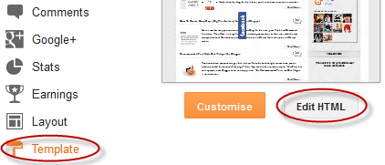
Step 1. Go to Template > Edit HTML


Step 2. Select the "Expand widget templates" box

 Step 3. Search for the following piece of code:

 ]]></b:skin>

Step 4. Just above it, add the following CSS code:

 /* Vintage Images
----------------------------------------------- */
.vintage img {
padding:0;
float:left;
}
.vintage {
border:10px solid #000;
position: relative;
float: left; /* Change to right if you want the images to be aligned to the right */
margin-right: 20px;
margin-bottom: 20px;
}
.vintage:before {
content: "";
display: block;
position: absolute;
top: 0;
bottom: 0;
left: 0;
right: 0;
background-color: rgba(255,102,0, 0.6); /* sepia */
background-image:url(http://2.bp.blogspot.com/-Qva8IVtO25k/UFejhDww-zI/AAAAAAAADAY/RnlCb7JO0xs/s000/grunge.png);
background-size: cover;
box-shadow: inset 0 0 50px #000, inset 0 0 50px #000, inset 0 0 50px #000;
-moz-transition: all 1s;
-webkit-transition: all 1s;
-o-transition: all 1s;
transition: all .1s;
}
.vintage:hover:before {
background: none;
box-shadow:none;
-moz-transition: all 1s;
-webkit-transition: all 1s;
-o-transition: all 1s;
transition: all .1s;
}

Note: In the first code, you see in bold the line that corresponds to the color of the image, you can change it to any other color, these are some examples of traditional vintage:

 background-color: rgba(0,0,255, 0.5); /* blue */
background-color: rgba(0,255,0, 0.5); /* green */
background-color: rgba(0,255,255, 0.5); /* cyan */
background-color: rgba(255,0,0, 0.5); /* red */
background-color: rgba(255,0,240, 0.5); /* violet */

If you want the image to not change to its original state on mouse hover, then remove the last code:

 .vintage:hover:before {
background: none;
box-shadow:none;
-moz-transition: all 1s;
-webkit-transition: all 1s;
-o-transition: all 1s;
transition: all .1s;
}

Step 5. After you've made your changes, click on Save Template

Step 6. Finally, add this code inside your posts each time you want to apply the vintage effect to an image (switch to HTML tab if you want to use this code inside your post)

 <div class="vintage">
<img border="0" src="URL of the image" /></div>
<div style="clear: both;"/>

And add the URL of the image to where is the text in blue.

And that's it, with this little experiment you can have your vintage-style images using CSS only. Enjoy!

Create Horizontal Navigation Menu With Drop Down Submenus Using CSS

The following drop down menu is made only with CSS, is a horizontal menu with sub-tabs and the right side has a rounded search. A menu is handy for those who do not require complex menus or prefer not to use one that requires scripts and/or too many images, also the installation and customization is quite simple, and to top it off is quite functional.

To see this drop down menu in action, visit this demo blog 

blogger menu, drop down menu, css menu

Prior to doing anything, if you are using a Template made through Blogger Template Designer, then you should consider doing these changes in the template, otherwise the menu might not be displayed correctly:

From your Blogger's Dashboard, go to Template (make a backup < see the screenshot) > Edit HTML:


and search (CTRL + F) for the following line:

 <b:section class='tabs' id='crosscol' maxwidgets='1' showaddelement='yes'>

Screenshot

Remove the code in red.
You may have many parts as the one in red, delete all you find.

....then find this section in your template:
 /* Tabs
----------------------------------------------- */

...and remove all that is within it, until you reach to the Headings part. 

 /* Tabs
----------------------------------------------- */
.tabs-outer {
overflow: hidden;
position: relative;
background: $(tabs.background.color) $(tabs.background.gradient) repeat scroll 0 0;
}

#layout .tabs-outer {
overflow: visible;
}

.tabs-cap-top, .tabs-cap-bottom {
position: absolute;
width: 100%;

border-top: 1px solid $(tabs.border.color);

}

.tabs-cap-bottom {
bottom: 0;
}

.tabs-inner .widget li a {
display: inline-block;

margin: 0;
padding: .6em 1.5em;

font: $(tabs.font);
color: $(tabs.text.color);

border-top: 1px solid $(tabs.border.color);
border-bottom: 1px solid $(tabs.border.color);
border-$startSide: 1px solid $(tabs.border.color);
}

.tabs-inner .widget li:last-child a {
border-$endSide: 1px solid $(tabs.border.color);
}

.tabs-inner .widget li.selected a, .tabs-inner .widget li a:hover {
background: $(tabs.selected.background.color) $(tabs.background.gradient) repeat-x scroll 0 -100px;
color: $(tabs.selected.text.color);
}

/* Headings
----------------------------------------------- */

Then add this to where the code has been removed (instead of the code in green):
 #crosscol ul {z-index: 200; padding:0 !important;}
#crosscol li:hover {position:relative;}
#crosscol ul li {padding:0 !important;}
.tabs-outer {z-index:1;}
.tabs .widget ul, .tabs .widget ul {overflow: visible;}
Having done this, we can finally add our menu.

How To Add Horizontal Drop Down Menu to Blogger 

To put this horizontal menu with submenus in your blog, then follow the next steps:

Step 1. From Template, go to Edit HTML and just above ]]></b:skin> paste these styles:
 /* Horizontal drop down menu
----------------------------------------------- */
#menuWrapper {
width:100%; /* Menu width */
height:35px;
padding-left:14px;
background:#333; /* Background color */
border-radius: 10px;
}
.menu {
padding:0;
margin:0;
list-style:none;
height:35px;
position:relative;
z-index:5;
font-family:arial, verdana, sans-serif;
}
.menu li:hover li a {
background:none;
}
.menu li.top {display:block; float:left;}
.menu li a.top_link {
display:block;
float:left;
height:35px;
line-height:34px;
color:#ccc;
text-decoration:none;
font-family:"Verdana", sans-serif;
font-size:12px; /* Font size */
font-weight:bold;
padding:0 0 0 12px;
cursor:pointer;
}
.menu li a.top_link span {
float:left;
display:block;
padding:0 24px 0 12px;
height:35px;
}
.menu li a.top_link span.down {
float:left;
display:block;
padding:0 24px 0 12px;
height:35px;
}
.menu li a.top_link:hover, .menu li:hover > a.top_link {color:#fff; }
.menu li:hover {position:relative; z-index:2;}
.menu ul,
.menu li:hover ul ul,
.menu li:hover ul li:hover ul ul,
.menu li:hover ul li:hover ul li:hover ul ul,
.menu li:hover ul li:hover ul li:hover ul li:hover ul ul
{position:absolute; left:-9999px; top:-9999px; width:0; height:0; margin:0; padding:0; list-style:none;}

.menu li:hover ul.sub {
left:0;
top:35px;
background:#333; /* Submenu background color */
padding:3px;
white-space:nowrap;
width:200px;
height:auto;
z-index:3;
}
.menu li:hover ul.sub li {
display:block;
height:30px;
position:relative;
float:left;
width:200px;
font-weight:normal;
}
.menu li:hover ul.sub li a{
display:block;
height:30px;
width:200px;
line-height:30px;
text-indent:5px;
color:#ccc;
text-decoration:none;
}
.menu li ul.sub li a.fly {
/* Submenu Background Color */
background:#333 url(http://2.bp.blogspot.com/-38QeToUdU48/UWmqpRNO-LI/AAAAAAAADP4/A4AJhnSm0Fg/s1600/arrow_over.gif) 185px 10px no-repeat;}
.menu li:hover ul.sub li a:hover {
background:#515151; /* Background Color on mouseover */
color:#fff;
}
.menu li:hover ul.sub li a.fly:hover, .menu li:hover ul li:hover > a.fly {
/* Background on Mouseover */
background:#646464 url(http://2.bp.blogspot.com/-38QeToUdU48/UWmqpRNO-LI/AAAAAAAADP4/A4AJhnSm0Fg/s1600/arrow_over.gif) 185px 10px no-repeat; color:#fff;}

.menu li:hover ul li:hover ul,
.menu li:hover ul li:hover ul li:hover ul,
.menu li:hover ul li:hover ul li:hover ul li:hover ul,
.menu li:hover ul li:hover ul li:hover ul li:hover ul li:hover ul {
left:200px;
top:-4px;
background: #333; /* Background Color of the Submenu */
padding:3px;
white-space:nowrap;
width:200px;
z-index:4;
height:auto;
}
#search {
width: 228px; /* Width of the Search Box */
height: 50px;
float: right;
z-index: 2;
text-align: center;
margin-top: 5px;
margin-right: 6px;
/* Background of the Search Box */
background: url(http://2.bp.blogspot.com/-kSPW07r2Ct8/UazXPD9DbfI/AAAAAAAADtE/UyopBgIPe-w/s1600/searchBar1.png) no-repeat;
}
#search-box {
margin-top: 3px;
border:0px;
background: transparent;
text-align:center;
}


Screenshot
Step 2. Save the Template


Step 3. Go to Layout > click on Add a Gadget link


Step 4. Choose HTML/Javascript and paste the following inside the empty box:

 <div id='menuWrapper'>
<ul class='menu'>
<li class='top'><a class='top_link' href='Link URL'><span>Title 1</span></a></li>

<li class='top'><a class='top_link' href='Link URL'><span class='down'>Title 2</span></a><ul class='sub'><li><a class='fly' href='Link URL'>Submenu 2.1</a><ul>
<li><a href='Link URL'>Submenu 2.1.1</a></li>
<li><a href='Link URL'>Submenu 2.1.2</a></li>
<li><a href='Link URL'>Submenu 2.1.3</a></li>
</ul>
</li>
<li class='mid'><a class='fly' href='Link URL'>Submenu 2.2</a>
<ul>
<li><a href='Link URL'>Submenu 2.2.1</a></li>
<li><a href='Link URL'>Submenu 2.2.2</a></li>
<li><a href='Link URL'>Submenu 2.2.3</a></li>
<li><a class='fly' href='Link URL'>Submenu 2.2.4</a>
<ul>
<li><a href='Link URL'>Submenu 2.2.4.1</a></li>
<li><a href='Link URL'>Submenu 2.2.4.2</a></li>
<li><a href='Link URL'>Submenu 2.2.4.3</a></li>
</ul>
</li>
<li><a href='Link URL'>Submenu 2.2.5</a></li>
<li><a class='fly' href='Link URL'>Submenu 2.2.6</a>
<ul>
<li><a href='Link URL'>Submenu 2.2.6.1</a></li>
<li><a href='Link URL'>Submenu 2.2.6.2</a></li>
</ul>
</li>
</ul>
</li>
<li><a href='Link URL'>Submenu 2.3</a></li>
<li><a href='Link URL'>Submenu 2.4</a></li>
<li><a href='Link URL'>Submenu 2.5</a></li>
</ul>
</li>

<li class='top'><a class='top_link' href='Link URL'><span class='down'>Title 3</span></a>
<ul class='sub'>
<li><a href='Link URL'>Submenu 3.1</a></li>
<li><a href='Link URL'>Submenu 3.2</a></li>
<li><a href='Link URL'>Submenu 3.3</a></li>
<li><a href='Link URL'>Submenu 3.4</a></li>
</ul>
</li>

<li class='top'><a class='top_link' href='Link URL'><span class='down'>Title 4</span></a>
<ul class='sub'>
<li><a href='Link URL'>Submenu 4.1</a></li>
<li><a class='fly' href='Link URL'>Submenu 4.2</a>
<ul>
<li><a href='Link URL'>Submenu 4.2.1</a></li>
<li><a href='Link URL'>Submenu 4.2.2</a></li>
<li><a href='Link URL'>Submenu 4.2.3</a></li>
<li><a href='Link URL'>Submenu 4.2.4</a></li>
<li><a href='Link URL'>Submenu 4.2.5</a></li>
<li><a href='Link URL'>Submenu 4.2.6</a></li>
</ul>
</li>
<li><a href='Link URL'>Submenu 4.3</a></li>
<li><a href='Link URL'>Submenu 4.4</a></li>
<li><a href='Link URL'>Submenu 4.5</a></li>
<li><a href='Link URL'>Submenu 4.6</a></li>
</ul>
</li>

<li class='top'><a class='top_link' href='Link URL'><span class='down'>Title 5</span></a>
<ul class='sub'>
<li><a href='Link URL'>Submenu 5.1</a></li>
<li><a href='Link URL'>Submenu 5.2</a></li>
<li><a href='Link URL'>Submenu 5.3</a></li>
</ul>
</li>


<!-- Search Bar -->
<li>
<form action='/search' id='search' method='get' name='searchForm' style='display:inline;'>
<input id='search-box' name='q' onblur='if (this.value == &quot;&quot;) this.value = &quot;Search here...&quot;;' onfocus='if (this.value == &quot;Search here...&quot;) this.value = &quot;&quot;;' size='28' type='text' value='Search here...'/></form>
</li>

</ul>
</div>

Customization:

- replace the text in blue and red with your links and titles.
- if you need more tabs, then add a line like this just above <!-- Search Bar -->

 <li class="top"><a href="Link URL" class="top_link"><span>Title</span></a></li>

- if you want to add a tab with sub-tabs, then add this code:

 <li class="top"><a href="Link URL" class="top_link"><span class="down">Title</span></a>
<ul class="sub">
<li><a href="Link URL">Submenu Title</a></li>
</ul>
</li>

- and if you want one of the other sub-tabs have sub-tabs then remove a line like the one in orange and change it to a code like this:

 <li><a href="Link URL" class="fly">Submenu Title</a>
<ul>
<li><a href="Link URL">Other Submenu</a></li>
</ul>
</li>

And that's it! Now Save your Widget and enjoy your new drop down menu! ;)
 
Copyright © 2013. Tutoriallogger - All Rights Reserved
Proudly powered by Blogger